
Back when I wrote exclusively about the Los Angeles Angels over on Angels Nation, I had a semi-recurring series where I put aside everything else and just focused on Uniforms and why I love them so much. With the Anaheim Ducks recently unveiling their new Third Jerseys and the NBA season right around the corner, I thought we’d take a look at the new looks in the NBA this season!
- Milwaukee Bucks

It seems like every year the Bucks get new jerseys or some new alternate… just last year they had updated all three of their jerseys. Those were alright, but these new ones are fresh as hell. A nice simple approach with a superbly basic color scheme. Gone is the Christmas Red that plagued this club in the past. Instead, you get green on white (or vice versa at home) in some great blocky-type lettering… some clean blocky numbers and a really vintage approach with some modern touches. These could be a top-five look in the league now.
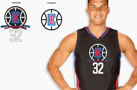
2. Los Angeles Clippers
*sigh* At least they didn’t go with the black monstrosity they were rumored to have back in April… It looked like a bad create-a-team jersey in NBA 2k14.
Even so, these new jerseys (along with the new logo) are just ugly as sin. I know the new ownership group wanted to distance themselves from the losing (and racist) history of the former owner, but holy hell, just move the team to a different city… don’t do this. These are the basketball jerseys of some alternate history where Michael Jordan played soccer instead of basketball, the sport never took off and miscreants were allowed to run teams.
I hope this is a one-and-done situation for the Clippers, or I’ll have to start blindly following another NBA team whose games I never watch.
3. Atlanta Hawks
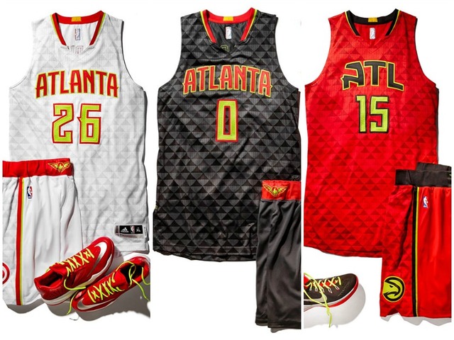
Yikes, and I thought the Clippers had it bad. Actually, with a nice, plain material on each of these uniforms, these wouldn’t be AS terrible (just regular terrible), but whatever weird Q-Bert block design they chose to go with… just yuck.
I do like the re-introduction of the old “pac-man” logo, but to slap it on these monstrosities is an injustice on the levels of the steroid bird logo the Blue Jays had for ONE season.
I feel like the Hawks need to drop the Yellow from their pallet completely, embrace the red, white and black… maybe stop using “ATL” as an abbreviation on their jerseys (there is enough room there for “Atlanta” or “Hawks”)… and go back to a simpler material.
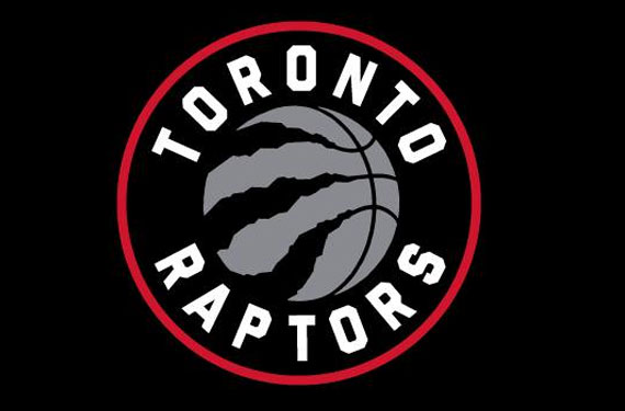
4. Toronto Raptors

Alright… okay… this is better. Nice and simple. There might be a bit too much of an arc on the lettering, but it’s a step in the right direction.
It does come with a fancy new logo and heightened expectations on the team last year (after falling a little flat in the playoffs despite a nice regular season, a fact I only know because I follow so many damn people from Toronto on Twitter). But I’m sure whomever is actually playing for the Raptors these days (probably not Vince Carter anymore, right?) will looks pretty good in this solid jersey. Kinda wish they’d go back to the old Purple scheme… but I suppose purple is a Lakers thing.
5. Philadelphia 76ers

Alright… new plan. If you can’t manage to fit the name of your city on your away jerseys… move the team to a city with less letters in it’s name. If you are in a city with an common acronym (see: LA, OKC, DC, NY, etc), okay… you get a pass… but this is getting out of hand. With Philly, it’s even worse, because if they had put “Philly”, I probably wouldn’t have had a problem! At least that’s a nickname for the city!
I know this is what the Sixers used to do, but just because we used to do something doesn’t mean we should keep doing it… (see: inequality, Jay Leno hosting things, etc) These jerseys are also too reminicent of the “retro” jerseys the Sixers have been going with the last few seasons. There are two GREAT “retro” jerseys in Philadelphia’s past: 1. The one Allen Iverson wore and 2. These patriotic masterpieces they had in the early 90’s.
These are boring, plain and don’t have enough going on. Take some risks, and I don’t mean the thirteen stars on the players crotch.
Overview: Basketball jerseys are probably my least favorite jerseys in all the sports I follow… but there are some fantastic exceptions out there (Lakers, Bulls). Obviously, the Milwaukee Bucks run away with the “Best New Jerseys of the 2015-16 NBA Season” Award, but the Raptors gave a decent effort as well. Worst New Jersey would disappointingly have to go to my beloved(?) Clippers. It’s gonna make it really tough to watch the first and last five minutes of their games this year.
Basketball sucks.
